Fujifilm Finepix F31fd Review (85%)

Now on the shelves in the UK, the Fujifilm FinePix F31fd represents a fairly minor update to last year’s F30 zoom, sporting the same impressive low light performance, courtesy of Fujifilm’s 6th-generation Super CCD and RP Processor II.
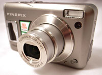
Fujifilm Finepix F31fd Review (85%)As with the F30, the 6.3 megapixel F31fd comes with a 3.0x optical zoom, super-high ISO 3200 sensitivity at full resolution, long-life battery (up to 580 shots), VGA movie recording up to 30 frames per second and Aperture & Shutter priority shooting plus a shedload of scene modes.

Sporting a redesigned, curvier body than its 2005 predecessors – the Fujifilm F10 and F11 snappers – the F31fd also adds a hardware-based Face Detection technology and infrared connectivity for sharing photos.

Boat race recognition
First seen in the company’s FinePix S6500fd’s bridge camera, Fujifilm’s Face Detection system is claimed to be able to identify faces, optimise settings and fire off a photo within just 0.05 seconds.
Fujifilm Finepix F31fd Review (85%)Capable of handling up to ten grinning faces in a frame, the technology should put an end to out of focus pictures, even when documenting a heavy night of quaffing in the old Bull and Bush.

To be honest, we weren’t exactly convinced of the benefits of the technology and would suggest that anyone used to focusing and reframing shots might as well buy the cheaper F30.

No looker
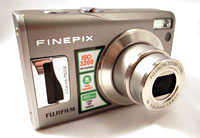
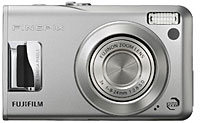
As with previous models, the Fujifilm is something of a plain, bulky fella unlikely to find favour with camera aesthetes, but behind those ordinary looks lurks some impressive picture taking capabilities.
Fujifilm Finepix F31fd Review (85%)
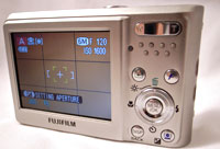
Along with the astonishing battery life – rated at around 580 shots per charge – the F31fd comes with a crisp and sharp 230,000 pixels, 2.5-inch screen LCD screen but, sadly, no optical viewfinder.

The 3x zoom lens covers a respectable 36-108mm (35mm equiv), with the aperture starting quite brightly at F2.8, closing down to a not-so-hot F5.0 at the telephoto end.

We would have preferred a bit more at the wide angle end, but at least Fujifilm have junked the annoying ‘terminal adaptor’ seen on the F10 and F11 cameras and fitted a proper DC port for the (supplied) mains adaptor.
Fujifilm Finepix F31fd Review (85%)
Unfortunately, the company has stuck with the XD card format, something that may put off potential buyers who have already aqcuired a collection of the more common SD card.

View from the top
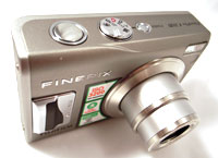
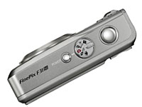
On the top of the camera is a rather fiddly mode dial offering Movie, A/S (aperture and shutter priority), Rec-Manual, Rec-Auto, Scene and ‘anti blur’ (which simply ramps the ISO rating up rather than providing any proper optical stabilisation).

Also on the top plate is the shutter release button and power on/off control.

As with previous models, the F31fd is very quick to start up, with the camera ready to shoot in under 2 seconds.

On the back
Next to the LCD screen on the back is a 4-way controller for navigating menus, surrounded by four additional buttons with a zoom in/out rocker switch above.
Fujifilm Finepix F31fd Review (85%)
Sitting in the bottom right hand corner is the button to activate the Face Detection system, which also doubles up as a useful exposure +/- control when in manual mode.

Using the F31fd

Once again, the Fujifilm excelled in low light and high ISO output, producing usable images when most of its rivals would be churning out grainy snowstorms of digital noise, making this an ideal camera for nights out.

We were able to get excellent results up to 400ISO, with even ISO 800 images remaining usable, although the built in AF illuminator didn’t stop us suffering quite a few out-of-focus grabbed shots in low light.

Daytime shots featuring lots of contrast could sometimes throw up the occasional over-exposed picture, but with a bit of care the F31fd was capable of excellent results.
Fujifilm Finepix F31fd Review (85%)The lack of real manual controls was a bit frustrating and we continue to find Fujifilm’s interface a little less intuitive than some of its rivals, but point’n’shooters should have no problem getting to grips with the camera.

However, all these minor niggles don’t stop us highly recommending the F31fd, with the camera offering class-leading low light performance, fast start up times, good flash performance and a sturdy build that should last for years.

Features: 80%
Ease of Use: 65%
Image Quality: 85%
Overall: 85%

Specifications
Number of effective pixels 6.3 million
CCD 1/1.7″ Super CCD HR
Image sizes: 2,848 × 2,136, 3,024 × 2,016 (3:2), 2,048 x 1,536, 1,600 x 1,200, 640 × 480
File format JPEG (Exif)
Storage media Internal memory (approx. 26MB) xD-Picture Card
Lens focal length 36-108 mm
Sensitivity AUTO / Equivalent to ISO 100/200/ 400/800/1600/3200
LCD 2.5″ Amorphous silicon, TFT 230,000 pixels
Movie Recording 640×480 / 320×240 pixels, 30 frames / sec with monaural sound
Voice memo Yes
Video output NTSC & PAL
Digital interface USB 2.0 (High-speed)
Power source NP-95 Lithium-ion battery, AC Power Adapter
Dimensions (W x H x D) 92.7 x 56.7 x 27.8 mm
Weight (approx./excluding battery and memory card) 155g
Fujifilm F31fd
dSLR Buyer Guide For Christmas

Christmas dSLR Round-UpRock Bottom: Nikon D40 £400 (with lens)
Buy it at Amazon UK, or US

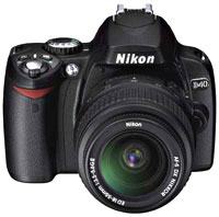
Nikon’s new D40 offers astonishingly good value for money, with UK stores selling the camera – complete with a 18-55mm f/3.5-5.6G ED zoom lens – for a measly £400. For a dSLR!

Designed for ease of use, the petite 6.1 megapixel snapper offers three-area autofocus, a bright 2.5″ LCD screen, and comes with eight Digital Vari-Programs (including Auto Flash Off, Portrait, Landscape, Child, Sports, Close-up and Night Portrait ) as well as a fully Auto setting for clueless point’n’shooters.

Despite it being at the bargain basement end of Nikon’s range, the D40’s a respectable performer, mustering a near-instant 0.18s start-up time and a nippy 2.5fps continuous shooting.

The Nikon also sports a wide 200-1600 ISO sensitivity range, and comes with in-camera editing tools for retouching and enhancing images.

Of course, at this ridiculously low price something had to give, and in this case there’s no mechanical focus drive pin, meaning that it can only autofocus with AF-S and AF-I lenses (which have built-in focus motors).

Many will view that a small compromise for the superior handling, versatility and speed that a dSLR gives over similarly-priced digital ‘bridge’ cameras, making this a hell of a lot of camera for the price.

Full review: DPreview
Buy it at Amazon UK, or US

Other options: Nikon D50 £325 (body only)
Buy it at Amazon UK, or US

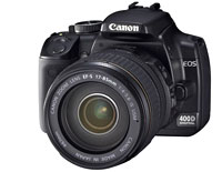
Christmas dSLR Round-UpBudget: Canon EOS E400D (£500 body-only)
Buy it at Amazon UK

Competition is fierce around the half-grand mark, but Canon’s new E400D has just enough features to make it our choice at this price.

Boasting an lightning fast auto-focus system and nippy evaluative metering, the E400D is capable of great results, with the Integrated Cleaning System (featuring anti-static coatings, anti-dust materials and ultra-sonic vibration) keeping the gunge out of your shots.

The ISO range runs a useful distance from 100-1600, with a 30secs – 1/4000 shutter speed range.

It’s pretty small too, making it a great compact, go-anywhere camera and a fine introduction to the Canon range.

Full review: DPreview
Buy it at Amazon UK

Other options: Sony Alpha 100 £550 (body only)
News
Buy it at Amazon UK, or US

Pentax K100D £500 (body only)
News
Buy it at Amazon UK, or US

Christmas dSLR Round-UpEnthusiast: Nikon D80 (£600 body only)
DL Review
News
Buy it at Amazon UK, or US

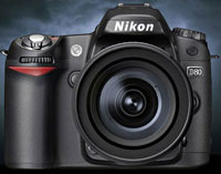
Offering many of the attributes of the pricier D200, the D80 comes with a 10.2 megapixel sensor, a shutter range from 30secs to 1/4000 and a 100-1600 ISO range (up to ISO 3200 with boost).

A sophisticated 3D color matrix metering system backed by 11-area AF system churns out pin-sharp, perfectly exposed shots, with the solidly-built camera adding to the impression that this is a ‘can-do’ camera.

Add to that a vastly improved user interface, instant power-on, customised settings and a big, bright viewfinder and you’ve got the perfect choice for enthusiasts or budget-minded pros.

We liked it so much, we went out and bought it!

DL Review
News
Buy it at Amazon UK, or US

Other options: Olympus E-400 (£700 with Zuiko 14-42mm zoom lens)
News

3 X-Series Review (89%)

3 X-Series Review (89%)The first time Nokia told me that they no longer sold mobile phones, but multimedia computers, I scoffed. How can anything that you speak on while moving be anything but a mobile phone? You talk, you walk. Anything else is a handy extra, a camera to snap while you’re at a gig or a site to browse for train times when you’re in a hurry.
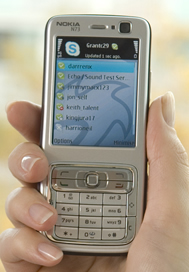
But when I picked up the X-Series Nokia N73 phone from 3, everything became clear. Because it’s simply not accurate to call this device a mobile phone any longer. The N73 is, in essence, a powerful 3G handset that uses a variety of technologies to perform a variety of tasks using a variety of services. And if that sounds woolly and imprecise, welcome to the 21st century.

The hardware
Let’s start with the hardware – arguably the least interesting aspect of the package. The N73 is part of Nokia’s multimedia N-series, and so boasts a pin-sharp 2.4-inch screen, 3.2MP camera, media players, stereo Bluetooth, office software and more. It’s simple to use, less bulky than the photo-mad N93 (home to an optical zoom) but more than capable of dealing with everyday photos, files, songs and videos.

It lacks the Wi-Fi aerial of the business-focused N80 – but then it really doesn’t need it, thanks to 3’s innovative X-Series web pricing. This offers all-you-can-surf web access via 3G for a price of £5 a month on top of any 12-month or longer contract. That represents stunning value for money when compared to traditional networks, and is still a few quid less than T-Mobile’s generous £7.50 Web ‘n’ Walk monthly cost.

3 X-Series Review (89%)Using Skype On The X-Series
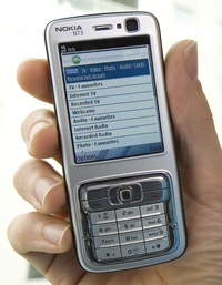
Above and beyond that, the hot news is the packages that the N73 comes pre-loaded with: Skype, Yahoo Go!, Mobile Mail, MSN Messenger and, for another £5 per month, Sling and Orb. The revolutionary package is, of course, Skype. The world’s most popular VOIP application earns one-touch access from the home screen and has been well optimised for the mobile platform. You can sign in with your normal Skype name to see your usual contact list, or create an account there and then. My phone had to download an update (less than a minute) and then plough through a variety of disclaimers and permissions – basically absolving 3 of any responsibility for you trying to call the emergency services.

Refreshing and adding contacts is all very easy and making a call is utterly intuitive: simply select a contact and hit the dial key. Voice calls sounded compressed but comprehensible. The usual Skype delays on the line are more pronounced than with a PC, but you do feel the benefit of a genuinely well-engineered speaker and microphone instead of the usual cheapo VOIP headsets. The current version works only with other Skype accounts, although 3 promises the ability to Skype Out (calls to any real phone number, globally, charged at pennies a minute) in 2007.

Incoming calls don’t specify which contact is calling, relying instead on a generic ‘Skype Service calling’ message. And Skype chat doesn’t work either, although your contact does receive a message encouraging them to call instead. Running Skype on your computer and phone simultaneously doesn’t cause any problems either – both devices will ring and you can simply answer whichever you choose. If you do want to IM, the pre-loaded MSN and Yahoo Messenger software seem to work fine.

Slingbox – TV on your X-series
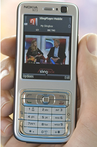
So why would you upgrade from the Silver package (£5/month extra) to the Gold (£10/month?). The key offering here is the Slingbox, which you can buy at a discounted price of £99 (it’s usually about £150). This connects to your TV or set-top box and fires video over your domestic broadband service to the X-Series handset (or a laptop) running the SlingPlayer software. Unlike other mobile TV services, this is actually streaming your very own telly signals, so if you’ve got a Sky box, for instance, you’ll be able to watch exactly what’s showing on your TV at home, be it BBC One, Premiership footie or a ‘specialist’ subscription channel.

However, it’s worth noting that the Slingbox can be a real pig to set up. If you have a complex broadband set-up with multiple routers, you’d better be good at port forwarding and hacking your router configuration or you’ll soon be pulling your hair out. If you can get it to work, video quality is pretty good; detailed enough to read the info bar on Sky broadcasts for instance. Sound is below average and can be quite harsh and glitchy. Unfortunately, you’re limited to portrait format display, leaving massive empty bands above and below the images – why no landscape option to make full use of that great screen?

Menus give access to your home device’s basic features (power, channel and volume, menu etc). I was disappointed that I couldn’t access recorded shows on my Sky HD box because the SlingPlayer lacks virtual red/green/yellow/blue buttons. This would be a key selling point, widening the video service from live TV to my entire hard drive. Note that the Slingbox is happy to sling (resized, compressed) HD signals out to your phone.

3 X-Series Review (89%)Accessing your PC using OrbPC
Supposedly, you need to sign up to the Gold service to use PC-away-from-home service Orb, although I’ve been using Orb on a Wi-Fi phone for some time and can’t see why normal web access to Orb wouldn’t work perfectly well. If this is a driver for you, check out the Silver package first. Orb allows you to view (read-only) the contents of various folders on your PC’s hard drive, giving access to your photos, videos and MP3 tunes, for example, and even files in your My Documents folder. It’s great for finding those essential business documents or staging impromptu holiday slideshows, without taking up memory space in the phone itself. The interface is a little flaky but normally gets there in the end.

On top of all this, of course, you’ve got full, free web access. The browser from 3 modifies pages to look ‘better’ on the Nokia’s small screen. This devastates design but (usually) improves legibility. You’ll either love or hate this but it’s well worth trying before you buy given that you’ll be using that interface an awful lot.

Conclusion
Overall, this is a really interesting device. The web access alone represents tremendous value and the pre-loaded, generally hassle-free applications only make it more attractive. However, there’s no denying that as it stands the X-Series is a tremendously geeky offering. Skype sounds better than it sounds, if you get my drift, although it’ll soon pay off if you regularly call abroad. Slingbox is fun but sluggish and over-complicated to set up – and battery life is bound to suffer.

Make no mistake, the X-Series is the future. Whether we’re ready to take the giant leap forward that it represents yet is another question entirely…

Score: 89%

3 X-series

BT Internet Radio Review (75%)

BT Internet Radio Review (75%)With last week’s launch of it’s TV over the Internet service, a raft of integrated net-based services and a slew of new hardware devices, BT has relauched itself as a multi-media service provider instead of a plain old utility company. The BT Internet Radio shows another face of BT’s rebranding. It’s a slickly designed consumer electrical product aimed directly at the growing digital radio sector.

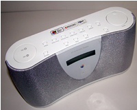
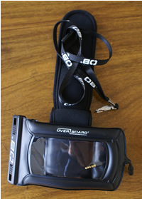
The design of the device itself echoes Apple’s trademark austere, white aesthetic. Organically shaped, it has no straight edges or corners and is slightly flared towards the base. Wraparound silver mesh panels add some contrast and a front centred LED displays information in a soft blue light. On top are a series of quite ‘plasticy’ buttons. Two larger buttons provide volume control and menu navigation and various others control playback, station memory, alarm and other functions.

Setting it up is a breeze. A simple press button starts the device scanning for your wireless network. You log on using the scrolling navigation button to enter your normal network password and the radio takes care of the rest.

Once online, stations are accessed through the same navigation button. They are grouped by location or genre, though there doesn’t appear to be a way just to browse all available stations. A series of sub-menus gives access to the features of each station. A choice between live and on demand material is visible where archived material is available. This means you can access services like the BBC’s listen-again service, picking programmes from all the recent BBC broadcasts for the last seven days. More sub menus allow you to choose programmes and days where appropriate.

BT Internet Radio Review (75%)Choosing between stations is a bit of a hit and miss affair. If your tastes tend towards anything beyond the mainstream categorizations (rock, pop, dance, hip hop etc) you’ll struggle to find the music you want to hear. This, of course, isn’t BT’s fault. The device uses the Reciva Internet Portal to aggregate its stations. If you access the Reciva Website (Reciva) you can find some more detail on the content of stations but, since Reciva (like the Gracenote database) allows users to add information there are some frustratingly arbitrary categorizations. That said, there are over 5000 stations available and, once I located Resonance FM under the experimental section I was happily listening to an assortment of droning and scraping, Bollywood soundtracks and post-modern poetry.
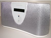
Sound quality is quite adequate and better than that produced by most internal computer speakers. The sound is deep and clear with none of the echoing or breakup that DAB radio is prone to. There are, however, a couple of niggles with sound adjustment. There is no way to adjust bass or treble and the volume control does not automatically increase when held down, meaning you have to keep pressing to raise or lower volume. Unlike DAB, the radio doesn’t display any info (such as such as track titles) about the source.

Using the unit was no problem though there were some irritations. It tends to hang on to the last programme played and starts up replaying that every time. In the case of a live station that’s ok but for archived content it can become annoying. The radio is also subject to same problems you would encounter with any wireless device: proximity to router and the number of walls in between can affect reception. I noticed a tendency for buffering in most locations in which I tried. Access to a signal is entirely dependent on your internet connection being on. My router drops the line when it isn’t in use therefore the auto-play alarm function is no use. When the unit reconnects to the network after being switched off, it uses the saved security key however I found that often the logon failed a second attempt was required.

BT Internet Radio Review (75%)The device can access and playback MP3 or other audio files from a networked PC. An extremely useful feature and one that really capitalizes on the network power of the unit. It probably would have done the most to sell this device to me. In practice it was unable to connect to my PC so I had to leave the feature untested. Typically, macs are not supported and I was unable to access my sizable MP3 collection via either of the macs on the network. It’s not surprising that BT have chosen to adopt Windows technology for integration with computers but it is disappointing that they couldn’t have adopted an interoperable standard which would have supported any operating system.
Given that Windows-centric tendency I wonder exactly who the Internet Radio will be useful to? On one hand it brings a host of Internet radio stations and a variety of useful services and features into one portable unit. It’s easy to set up and use and, in the right circumstances, has the potential to integrate with an existing network to provide extended access to shared music files.

On the other hand, it is only Windows compatible and therefore restricted in terms of both OS and DRM technologies.

Conclusion

If you are already streaming audio over your wireless network, there isn’t a whole lot of extra functionality in this box. Since a wireless network is a necessary prerequisite for the unit to work, I have to wonder how many people will find it sufficiently superior to their existing methods of playback to make it worth the £120 price tag.

Score: 75%

OverBoard Pro-Sports Waterproof MP3 Case Review (65%)

OverBoard Pro-Sports Waterproof MP3 Case Review (65%)Waterproof gadgets aren’t just for the lounging by the pool in the summer. Despite its rather alarming name (“Stop the ferry! iPod overboard!”), this case promises to protect your tunes from the worst the winter weather can throw at you, as well as providing full waterproofing to a depth of six metres for summertime use.
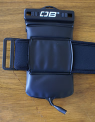
The £15 case is made from padded vinyl, with a clear window to let you see what your player is up to. It’s been designed for market-leading Apples, and an 8th-gen 80Gb iPod does indeed slide in extremely snugly. A close fit is important to avoid excessive motion, which can damage miniature hard drives. However, if you’re planning to use the OverBoard for vigorous jogging or skiing, a totally solid state player such as a Nano will always be more resilient than a hard drive unit.

Despite being designed for full-size iPods, which have the headphone socket on the top right corner, the internal headphone jack is centrally mounted, so there’s a degree of awkwardness in marrying the plugs. Once it’s in, though, it feels quite secure and shows no sign of working itself loose.

The most important part of any waterproof case is the seal and this has a familiar self-tightening sliding design. You need to pull both switches outwards to open the seal. Unfortunately, the seal lacks a safety interlock of any kind and the pressure needed to release it is worryingly light. I would definitely be concerned about accidentally opening the unit while mucking about in a swimming pool or snorkelling in the surf. The seal proved effective in basic waterproofing, although a very small amount of water did find it way into the seal. This could leak into the case when you subsequently open the seal.

OverBoard Pro-Sports Waterproof MP3 Case Review (65%)The case comes with a small eyelet for a lanyard (supplied) and a large Velcro armband. This is tougher and more comfortable than the standard Apple armband, for example, and closes very firmly – a quality piece of kit. Assuming you want to read your iPod’s display and have the headphone jack upward, that means the seal faces downward – another potential concern if the seal were to accidentally open while you’re running.

The good news is that the Apple clickwheel works perfectly well through the plastic window, and the screen is clearly visible – you could easily watch downloaded video clips while bobbing on a lilo. Sound quality is not noticeably affected by the intervening jacks. Even with an 80Gb iPod (the heaviest Apple currently available) inside, the case floats in fresh water.

Conclusion

The OverBoard has clearly had some thought go into it. It’s well padded, easy to use the player inside and has an excellent armband. But the seal system is neither secure enough nor convincingly impenetrable for the most active users. The warning on the package that ‘contents should be insured separately’ seems like very sensible advice.

A good solution for casual use near snow, rain, water and dust, then, but athletes and divers should definitely spend a little more on protection.

Score: 65%

YourMinis Review:Ajax Homepages Explained

YourMinis Review:Ajax homepages ExplainedWhat are Ajax homepages?
Examples of some of the ideas behind the new spate of Internet applications, described by those in the know as Web 2.0, include Ajax, RSS, aggregation and user generated content. Most types of applications tend to choose just one or two characteristics of Web 2.0, but if there is one space which typifies the approach of the new Web, it is Ajax Homepages.

The companies behind them, want you to set them as your browser homepage, and they each provide a multitude of ‘widgets’ for you to drag-and-drop onto your homepage, updating you on incoming email, latest items in RSS feeds you are watching. These widgets can also work as mini programs, providing functionality from calculators to free sending of text messages. The early releases came from Google (who decided to go out on a limb, naming theirs the Personalised Homepage), Netvibes and Pageflakes. In this article I want to give you a quick rundown on why I think Ajax homepages are becoming increasingly important and what challenges they face if they want to become successful.
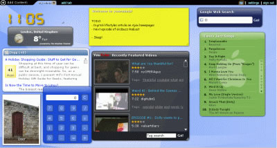
YourminisThe best way to do this is probably through a case-study of my favourite Ajax homepage, yourminis. It’s actually inaccurate to call yourminis an Ajax homepage, since it is built with Flash, a different Web technology. That doesn’t matter, because what I’m really interested in here is what one might call the ‘ideology’ of these Web 2.0 homepages rather than the underlying technology.

When you first visit yourminis, you are given a page with default ‘minis’ (their word for widgets). These include a Digg module and a YouTube module, amongst others. It is possible to add more minis from an impressive selection that includes a calendar, an email module, the iTunes chart and an MP3 player. Yourminis is aiming to become a place where you can pull in information from all round the Web from the sites that interest you, and be able to quickly see what is new since you last opened up your browser. If you’re into photo sharing site Flickr, you can see the latest photos from there. You can set it up so that the latest posts from Digital-lifestyles appear.

There are so many possibilities, and that’s the whole point. No-one uses the web in exactly the same way, and so what yourminis and the applications like them are trying to do is to allow you to create your own personal portal, far more flexible than the attempts of the last Web revolution, such as MyYahoo, which was hard to customise and offered far less content in the first place.

YourMinis Review:Ajax homepages Explained

A feature that I particularly like about yourminis is the ability to publish pages that you have produced, so that your friends can see them. You could use it for research, or a more colourful example used by Goowy’s CEO, Alex Bard, is a page dedicated to a favourite band, with the latest news about them from various fan blogs combined with album art, all with their music playing in the background.

So, now you know why you should use a product like yourminis, but what does the future hold for them? A key challenge faced by providers of these Ajax homepages is monetisation; users would undoubtedly react badly to any attempt to plaster banner ads, or even contextual text links, onto their page that they have created. This was one of the questions I asked Goowy’s CEO when I interviewed him recently, and his approach to the monetisation of yourminis involves ‘value added revenue generation’. An example of this might be the affiliate revenue earned by yourminis when a user buys something from ebay using a mini on youminis. Around the biggest players (particularly Google), an ecosystem of third party developers producing widgets for the service is developing. As this happens, and the process of developing widgets becomes easier, the flexibility of the systems can only increase.

Huw Leslie is editor of UK-based Web 2.0 and software blog Gizbuzz, and the co-founder of technology blog network Oratos Media. His personal blog is For Crying Out Loud!

Belkin Skype Phone Review (71%)

Belkin Skype Phone  (71%)It’s coming up to Xmas and everyone’s making Skype accessories. Belkin are no exception and have joined the crowd to release a Skype phone, in BLACK.
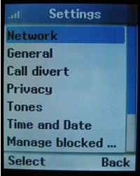
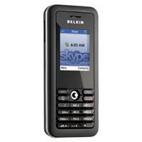
It’s reminiscent of a SonyEricsson T610, but bigger – measuring about 4.5″ by 2″ by 5/8″ (11.5cm by 5cm by 2cm). The screen looks bigger than it is, as there’s about 3/4″ between it and the keypad. It’s actually only 1.5″ by 1.12″, which is big enough to show 7 contacts at a time.

It’s not really a phone in the normal sense, just an embedded Skype client on dedicated hardware.

It’s Skype, but not as you know it
Skype on a PC environment is more functional, for a start this phone version doesn’t allow text instant messages (IM), it only supports the voice functionality of Skype (even though the keyboard does allow text input, much like a mobile phone except no predictive text).

Once the device is configured, the screen will display the current time and your Skype balance with two softkeys at the bottom of the screen showing “menu” and “Contacts”.

Belkin Skype PhoneIf you’ve got credit you can make normal calls to the PSTN (i.e.ordinary phones), but you have to type the telephone number in international format (i.e. putting +44 infront of the number and dropping the leading zero). Unless you’ve got a SkypeIn number, the called phone will show “Number Unavailable” when you call.
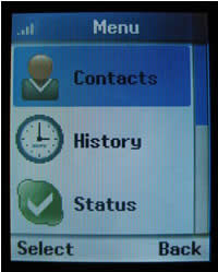
Dialing contacts is easy, just hit the right soft key and they’ll be listed, go to the one you want and hit the green “dial” button (or you can use the left soft key which will show “options” and then select “call”). You can also leave them a voicemail (if they have thatservice) or view their profile.

WiFi isn’t HiFi
Call quality is pretty good, though it’s reliant on both the WiFi and Internet connection which can both vary depending on the environment.

As a WiFi phone, it’s permanently connected to the Internet whether it’s being used or not and though it can blank the screen, the Skype client is running all the time the phone is on, which means it’s eating into the battery life.

Though using the phone will increase the rate the battery discharges, WiFi isn’t particularly battery friendly. Saying that, after a full charge the phone lasted at least 20 hours before turning itself off.

Belkin Skype PhonePhone Set-up
Setting the phone up is easy, but not trivial. It works through a WiFi connection so that the first thing that needs to be configured. The network should be configured with one of the WiFi security protocols (and if it’s not, do it NOW), the Belkin phone supports WEP and the newer more secure WPA protocols. The IP configuration will be automatic if the network is configured to dish out the settings (most are) though they can be entered manually.

Once the networking is configured, just enter the Skype log-in details and the client connects to the network, and just works.

All in all it took less than 2 minutes to make the first call – even with the pretty slow text input.

The phone software can also update itself over the network, but no software updates have so far been made available.

Internals
Though Belkin don’t say what’s in the phone there’s some clues from the copyright notices. Of course there’s Skype in there, but the P2P stuff is licensed from Joltid (who seem to be the company behind the technology in Kazaa etc and Skype too).

There’s also Qt licensed from Trolltech. Qt is a cross platform user interface available on Windows, MacOS and Linux. As the phone is unlikely to run either of the first two, it’s probably running embedded Linux, and Trolltech make a version of that too called Qtopia. So as a bet it’s running some variant of embedded Linux, Qtopia, Qt and a Linux variant of Skype.

Belkin Skype PhoneIt’s not perfect
The current phone isn’t perfect, the phone settings are static and are designed to work in a fixed home or office environment and are tied to a specified WiFi network.

As the phone doesn’t have a browser it’s not possible to utilise a public hotspot as there’s no way to enter your credentials to get on-line.

Belkin have said this will be possible with the next version which will have a Java micro-browser which will allow configuring hotspot settings and saving them too so it will be possible to configure the phone in a Starbucks then move to an Openzone network and the phone will continue working.

The phone costs around £99 which isn’t cheap, but having a Skype phone that isn’t tethered to a PC makes it usable whenever it’s needed.

Verdict
It’s a nicely built phone, though the screen’s a bit small. The most annoying thing is not being able to “chat” to people and other Skype users just get a message that the software’s to old or incompatible if they try to chat with you.

Suprisingly, battery life is pretty good.

Score: 71%

Nikon D80 Review (95%)

Nikon D80 Review (95%)Arriving just eight months after the announcement of the upmarket D200, Nikon’s new D80 builds on the success of 2004’s D70, offering a slew of enhancements, a larger LCD and an inevitable upping of the pixel count.
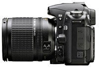
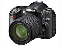
The D80 increases the pixel count by 67% on its predecessor to 10.2 megapixels, and manages to shrink the package down to more or less the size of the entry level D50 dSLR.

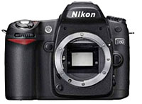
Although the reduction in size is welcome, it’s still quite a hefty beast compared to models from Olympus and Pentax, although there’s not a great deal of difference in bulk between rival cameras from Sony and Canon.

The D80 manages to borrow some of the high end features of the some of the company’s high-end cameras, inheriting the processing engine of the Nikon D2X, and the Nikon D200’s Multi CAM 1000 AF system, CCD, LCD and viewfinder.

Nikon D80 Review (95%)Clearly this mix’n’match approach makes sense for cost-aware Nikon, with interchangeable components helping to keep the prices down in a hugely competitive market, although the differences in build quality between the D80 and its big brother are clearly marked.
SD card
Users upgrading from the D70 may be mightily unchuffed to discover that Nikon has switched from Compact Flash to SD memory cards.

Capable of supporting the new Secure Digital High Capacity (SDHC) cards, this opens up potential capacities of up to 32GB and may help tempt users of compact cameras already using SD cards.

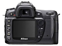
At the back of the camera we could see useful improvements to the button layout, and the 2.5″ LCD screen seemed positively enormous compared to the squinty 2″ screen on the D70.

Nikon D80 Review (95%)Interface upgrades
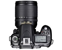
The on-screen user interface had also been considerably spruced up, using the same high resolution and anti-aliased fonts from the D200. The new image review zoom in/out controls improve massively on the fiddly controls of the D70.

The bigger, brighter 0.94X magnification viewfinder was equally well received; we loved the addition of the light switch to the on/off control and quickly felt right at home with the tweaked top plate layout.

ISO range has been improved to cover 100ISO right up to ISO3200 (with boost) with 0.3EV steps, backed by the same three custom NR (Noise Reduction) settings from the Nikon D200.

New editing menus offer built-in D-Lighting, Retouch Menu and Redeye removal capabilities, with a Pictmotion feature letting users playback images as slideshows.

Nikon D80 Review (95%)There’s also a host of new customisation options (a total of 32 custom functions) letting photographers set up the D80 to their needs.
Flash
Less good is the flash sync speed dropping down to 1/200, although we’re doubtful that most users will ever notice the difference.

The electronic-release pop-up flash raises automatically in appropriate Auto modes or can be triggered manually by pressing the flash button.

The flash offers a guide number of 13 (m at ISO 100) and can also act as a commander in a wireless flash setup.

Speed
We found the D80 to be a very, very fast performer, with a near-instantaneous start-up and barely measurable shutter lag ensuring we didn’t miss a shot.

With an eye to point’n’shooters, new Black & White modes offering additional Sepia and Cyanotype options have been included, along with the usual Program, Aperture priority, Shutter priority, Manual, Auto and six programmed modes (including a new Night Landscape mode).

Matrix metering inconsistencies
The D80 comes with Nikon’s smartypants 3D Colour Matrix Metering II automatic exposure control which consults a database of more than 30,000 actual photographic scenes to help evaluate brightness, colour, contrast, selected focus area and camera-to-subject distance.

Although it generally worked well in our tests, a couple of times it threw up some clearly over-exposed scenes, which suggests that it’s not quite as user-friendly as Nikon suggest (in fact, this issue has been a hot topic on the dpreview forums with photographer Ken Rockwell declaring his D80 meter to be “the worst of any Nikon I’ve used in 20 years.”)

Although a deft bit of dialling down with the exposure compensation button can fix this easily enough, it does seem markedly different to how the D70 metered and that’s something users will have to get used to.

Conclusion
Overall, we were very impressed with the D80. It feels like a significant step up from the D70, punching above its weight in features, usability and performance.

Nikon D80 Review (95%)The camera is easy to use, feels right in the hand with all the main controls falling easily to hand, and looks like it could take the occasional knock.
The improved viewfinder provides a big, bright view with the larger LCD screen and updated interface adding to the feeling that this is a real ‘photographers camera.’

Minor metering issues aside, images were crisp, clean and vibrant, with an improved high ISO performance making the camera a versatile performer in all conditions.

Although it’s priced ahead of its main rivals, the Canon EOS 400D and Sony Alpha, we feel that the D80 is well worth the extra outlay and offers the best all-rounder 10 megapixel DSLR of the bunch to date. Highly recommended.

Our verdict
Features: 90%
Ease of Use: 90%
Image Quality: 95%
Overall: 95%
Street price (body only) approx £599 (~$900, ~€585)

Nikon D80 main specifications

  • 10.2 megapixels
  • 11-area Multi-Cam 1000 AF system
  • ISO sensitivity range ISO100 to ISO1600 plus HI-1(equivalent ISO3200)
  • SDHC compatible
  • 2.5inch LCD screen
  • File formats – Compressed NEF or JPRG
  • Compatible with all Nikon AF lenses.
  • 3D colour matrix metering II, and centre-weighted or spot metering modes
  • Exposure metering range – EV0 to EV20 with 3D colour matrix or centre weighted metering
  • Exposure compensation up to +/-5EV
  • Shutter speed range – 30secs to 1/4000sec and bulb
  • Flash synch up to 1/200sec
  • Flash compensation -3 to +1EV
  • Depth-of-field preview
  • Rechargeable EN-EL3e Li-ion battery
  • Dimensions 132mm(W) x 103mm(H) x 77mm(D)
  • Weight – 585g without battery

Full D80 review at DPReview

AE17 16B Acoustic Energy WiFi Radio: Review (49%)

AE17 16B Acoustic Energy WiFi Radio: Review (49%)To me, there is something about the pleasure of listening to radio that is intrinsically linked to a discrete box that is a radio, and the PC experience does not quite match up, but the chance to tune into thousands of radio stations from the four corners of the world is something that excited me.
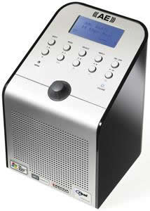
Over the last few weeks I have had the chance to use one of those new fangled Wi-Fi radios – the Acoustic Energy AE17 16B. I hoped it would deliver the best of both worlds. It looks like a radio, but when you fire it up on your wireless network, it gives you a window on that plethora of choice that the Internet has given to listeners of online radio stations.

The idea is that you ‘turn on’ the AE and pick either from one of ten pre-set stations, choose geographically, down to country level or from one of a range of genres that includes my own favourites, 70’s and Comedy.

After spending time listening around the world, my top channel so far is RTHK, which coming in strong from the other side of the world, instantly takes me back to happy days in Hong Kong with Lynx Disco Classics to remind me of my time in a few dodgy 70’s discos.

Audio quality is dependent on what the station pumps out to the Web. Virgin offers a respectable 128kbp/s, the same as you’ll hear on a DAB radio, while BBC Radio 4, which is mainly talk, seems to just about remain acceptable down to about 40kbp/s. You can listen to this audio either through the radios adequate built in speaker, or via the provided headphone socket.

Listening to channels isn’t always a dream. Rather annoyingly, there seem to be various conditions that drive the tastefully designed box to silence and a buffering message on the radios’ LCD display. This shows the potential problems of a producer of hardware that listen to Internet radio station – as you can’t reply on the delivery of the audio streams, listeners will blame the device.

The Wi-Fi radios get their channel lookup list from a Reciva gateway on the Internet, which keeps a record of the stations available and if you know of a station that’s not there, you can fill out the details online at the Web site at reciva.com.

As well as letting you navigate to on-demand content, the radio has a useful feature allowing you to access mp3 tunes stored on your PC, but I’ll be straight with you, I’ve not managed to work out exactly how to do that as yet. I will persevere, but like some of the features on the radio, it’s not intuitive or easy to use.

Summary
While it does perform well once it’s running, there is a problem with getting to that point.

Although the AE looks simple enough, with just a mains power supply to plug in and a headphone socket, it’s not something to confront a technophobe with. There’s a maze of pull down menus and you’ll need to put on your anorak to enter a hexadecimal address or two if your network is a secure one.

I really wanted to like this, so I’m afraid this is only a middling 49% on the score sheet until a more simple interface is developed. Currently this is a Christmas present for the geek in the family not your ageing maiden aunt.

Overall 49%

Acoustic Energy WiFi Radio

CDex 1.70 Freeware CD To MP3 Conversion Software (80%)

CDex 1.70 Freeware CD To MP3 Conversion Software (80%)Although many media players offer the facility to burn MP3 music tracks, the job is often made unnecessarily complex by fiddly menus or hard to find options.
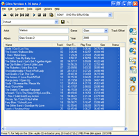
A compact 2.3MB download, the freeware CD Ripper looks to simplify the process of converting music CDs into MP3 tracks.

Although the interface isn’t the most intuitive we’ve ever some across, there’s some real power lurking underneath the no-nonsense program.

Running along the top of the program are a set of CD player controls underneath the usual drop down menus giving access to various settings and preferences.

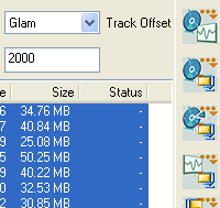
CDex 1.70 Freeware CD To MP3 Conversion Software (80%)The configuration tab lets you can customise output file name formats, add files to playlists (PLS or MPU), change output file directories, choose your CD-ROM source drive, change the rip offsets and turn jitter correction on/off.
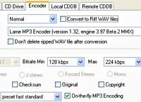
Under the encoder tab, you can set your preferred encoder, select the encoding bitrate, and set the mode to Stereo, Joint Stereo, Forced Stereo or Mono, with encoder options including Yamaha VQ, Microsoft WMA, Ogg Vorbis and a host of others we’d never heard of.

The main window is used to list the tracks to be burnt, with a set of icons running vertically along the right hand side of the program offering CD to WAV, CD to MPEG, Partial CD track to MPEG, WAV to MPEG and MPEG to WAV conversion options.

It has to be said that these icons aren’t the easiest to understand but at least hovering your mouse over them produces an explanatory text pop up.

Burn it up
Using CDex at the default settings is dead simple – shove a CD into your PC, load up CDex, select the tracks you want converted to MP3s, click on the “Extract CD Tracks To Compressed Audio files” button and sit back and let it do its stuff. Job done!

For those who like to have a little more control over the process, things can get a tad more complicated, with some of the menu options being a little vague.

For example, if you want to download individual track information for your CD tracks, you have to click on the ‘remote CDDB’ button (last but one button on the right hand menu) and so long as you’re connected to the internet, it’ll try and find the data from the freedb server.

CDex 1.70 Freeware CD To MP3 Conversion Software (80%)It’s a shame that the program makes no attempt to tell people what the chuffin’ heck ‘CDDB’ means (it stands for ‘CD Data Base’ ), and it took us a while to figure out how to set CDex up to automatically download the information (Options > Settings > Remote CDDB, select “Auto connect to remote CDDB” and include an email address).

You can also record sound files using your sound card via the Tools / Record Files menu, specifying where you want MP3 files stored on your PC, with a host of options letting you set folder naming conventions.

Conclusion
CDex is a simple, no-frills program for converting CDs to mp3s and vice versa, and it does the job with the minimum of fuss.

For users who just want to convert their CDs to MP3s without wading knee deep in menu options, it’s a great tool, and power users will appreciate the hands-on control that’s available in the advanced preferences.

However, complete newbies looking for big cartoon-like graphics and hand-holding wizards may find this program a little too fiddly for their tastes.

Despite its foibles, it’s long been our first choice for converting CDs to MP3 files – after all, it’s small, fast, simple and – best of all – it’s free! Why not give it a go too?

Features: 80%
Ease of use: 70%
Value For Money: 90%
Overall: 80%

CDexr