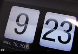
 Some clever French chaps calling themselves Generation Phone House seem to have got their hands on a pre-release HTC Touch HD – and luckily enough for all of us, they’ve shot a video showing the device.
Looks like HTC have done an excellent job of the interface which looks very, very slick and the browser is easily a match for the iPhones (and, of course, the screen is considerably bigger).
The screen quality is also highly impressive and with a 5Mpx camera, it blows away the iPhone’s.
Google Maps looks stunning. I’m impressed so far. Very impressed.
Comments
2 responses to “HTC Touch HD (Video) World First”
What’s interesting abut the video is that it shows HTC offering an entirely different user experience – it’s modern, fresh and crisp, and comprehensive enough to mean that many users will hardly ever have to dip down into the murky depths of WM’s antiquated interface.
HTC HD buyers will end up with a superb, class-leading spec’d phone with an interface that may be every bit as good as the iPhone for them – just so long as they’re not power users who will regularly need to rummage in the ugly WM gubbins.
I reviewed a Treo 500v a while ago that was running Vodafone’s own ‘shell’ interface and it proved to be an infinitely nicer experience than using what runs on the newer (and superior) Treo Pro, so it’s not WM that’s got better – it’s the third party vendors successfully pulling a highly usable and funky interface out of the unfriendly mess that is WM.
I’m really rather excited by the direction HTC is taking.
It does look mighty impressive (based only on what I’ve seen from the video).
One of the big concerns for me in Windows Mobile, so your comments on inoculating the user from it and how successful they’ve been is reassuring.
Just need to get one on your hands now :)