Make: Magazine For Electronic Dabblers: Review (90%)

Make: Magazine For Electronic Dabblers: ReviewIf you haven’t already seen the fabulous Make: technology magazine, we suggest you toddle over to their Website to get a flavour of what’s on offer.

The modern-day equivalent of a virtual granddad’s shed, this US-based magazine comes stuffed with loads of hand-on projects to keep soldering iron-totin’ geezers in fiddling about Heaven.

Although the mag is a pricy fella – around ten quid an issue in UK shops – it’s well worth the outlay for the offering of top tech tips, great stories, step-by-step ‘build your own’ guides, mad projects and other such eclectic treats for electronics dabblers.

Projects range from the fascinating to the useful to the plain daft, including instructions on how to make a, “dashboard mount for your mobile phone from an old hard-drive and a tuna can,” a “GPS bike mount for free,” a “wooden match rocket”, and – perfect for festival goers – a “camping lighting/sound system.”

Make: Magazine For Electronic Dabblers: ReviewThe projects require varying levels of technical know-how and competence, but the down to earth writing style and clear illustrations should get you reaching for your tool kit in double quick time – or provide an engrossing read at the very least.

The accompanying Website includes many of the projects featured in the magazines, with a busy user forum letting readers get involved, pick up tips, ask questions or offer their own projects.

Now up to volume 6, you can track down the magazine in bigger newsagents or order them from the Website, where back issues can be picked up for $15 a pop (a US subscription of four issues is priced at $35, but no doubt us Britlanders will end up paying a hefty premium once shipping costs are piled on top).

Make: Magazine For Electronic Dabblers: ReviewWe like Make: a lot. It’s fun, informative, wittily written and although it’s primarily aimed at adults, it’s a great way to get teenagers interested in science – even if some of the projects are more about having fun than pushing the envelope of science!

Volume 07 should be available in late August and will offer features on “Hack your plants, extract your DNA, 70’s soapbox saga, build a videocam rocket, and head-mounted water cannon.”

And if that lot doesn’t tempt you, we don’t know what will.

Score: 90%
Make: magazine

Sandisk Sansa Review (71%)

Forget the Nano, do the Sansa
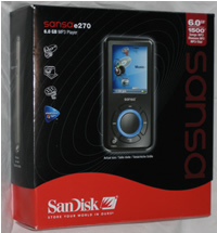
Sansa’s are a new range of portable media players from SanDisk. They come in several versions starting with the 2GB e250, the 4GB e260 and the 6GB e270. There’s also the possibility of adding to the internal memory as they have a microSD slot, unfortunately microSD cards currently only support up to 1GB.

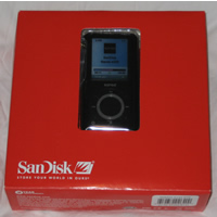
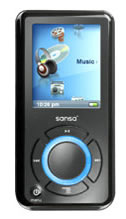
The packaging though functional, doesn’t meet Apple standards. Though the e270 which is 8.5cm long by 4.1cm wide and 1.1cm deep with a grey metal back (about 0.5cm deep) and a black plastic front, almost does.

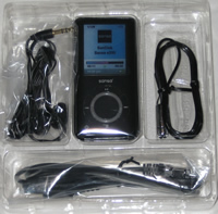
The display is about 3.5cm high and 2.7cm wide. It comes with headphones (which are quite big being over 1.5cm diameter), a USB lead (the Sansa itself has a proprietry connector – so you need the cable, it charges through USB), a lanyard and a soft case.

Though bigger than a Nano it fits comfortably in your pocket. The black headphones come on a 2 foot lead and are actually reasonably good, though their size might be uncomfortable for people with smaller ears.

It glows
Turn the device on and the first thing to notice is the glowing wheel on the front, a nice deep blue that stands out against the black face. It only stays on for about 10 seconds, then the display illuminates. The display is TFT and is very bright and vibrant.

The wheel is a wheel, it turns controlling the icons on the display (which are connected as though they are on the surface of a disc). Oddly the icons cycle in the opposite direction to the turning of the wheel, but for some reason it feels the right way to do it.

There are four buttons mounted around the wheel (like a compass) and one in the centre. Turn the wheel to the icon you want and press the centre to select it (generally the right hand button can also select things). The left button takes you back a menu/icon.

Media
The unit obviously plays MP3’s but also supports WMA including secure WMA files. Video is a MOV format and photos seem to be in bitmap format, luckily SanDisk supply some software called MediaConverter which does just that and converts various input formats into the correct format for the player. Images can be in JPEG, TIFF, PNG, BMP and GIF.

Video can be in AVI, MPEG-1 & MPEG-2 in MPEG, MPG, MPE or VOB (unprotected) formats. MPEG-4 in AVI format, DAT, ASF, QuickTime MOV, and WMV. Media Player 9 or 10 and Quicktime 6.5 or higher must be installed for QT MOV files.
Video is handled well and is converted to the high by long format (videos are watched by turning the player on its side), but photos aren’t and an external application may be used to flip them.

Connections
There are two modes of operating when plugging into a USB port of a PC, Mass Storage Class (MSC) and Media Transfer Protocol (MTP). MSC makes the Sansa look like a removable drive (one for the Sansa itself and another if a microSD card is inserted). MTP make the Sansa appear as a portable device (under XP) and uses Media Player 10 to transfer content, including subscription content from Microsoft’s service. SanDisk now have an upgrade utility that installs on the PC and will check the SanDisk site for firmware upgrade. The player must be in MSC mode for it to work.

Verdict
The Sansa isn’t an iPod, it’s not as easy to use but it is a pretty good little player and supports a good range of formats. You don’t actually need to use any other software if you just want music, just plug the Sansa into the PC and copy any music tracks saved on your PC. Playlists are a pain, and though they can be set on the Sansa, the more sensible way is to create them in Windows Media Player and sync them with Sansa.

Video and photos really requires MediaConverter to ensure they’re in the right format.

Mac users are out of luck, unless they just want to copy MP3s onto a raw disk.

Pricing
e250 – £89
e260 – £120
e270 – £150

Overall score: 71% – it’s small, with a good display and does more than a Nano.

Polycom Communicator Review: Handsfree Skype (83%)

Polycom Communicator Review: Handsfree Skype (83%)The Polycom Communicator (C100S) first caught our eye at the Skype-day in London. It’s a well-formed handsfree speaker/mic kit that connects to your PC via USB, letting you make trouble-free calls on Skype.

Polycom aren’t new to the field of handsfree. You may well have used their SoundStation in telephone conferences. They’ve leveraged this experience to tune the Communicator to minimise feedback.

Polycom Communicator Review: Handsfree Skype (83%)What’s it like to use
Getting it setup is breeze. When you’ve carried out the one-off process of installing the small piece of software on to the PC and authorised to allow it to work with Skype, you’re away.

We found it very easy to use, not only that, but were highly impressed with its performance.

Conversations flow more naturally, as if you were in the same room as the person, because you’re not holding a phone handset. The extra auto-echo-cancellation that has been built into it, also lets you use it without the other party realising.

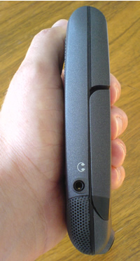
For those who are keen on secrecy, there’s a standard 3.5cm headphone socket in the right by the mic.

When you’re travelling and need to make a series of calls from your hotel room, the Communicator will be a boon. Forget using the cellular with an ear piece, this lets you sit in your hotel room and make your calls while taking advantage of Skype’s low-cost calling too.

The Communicator also has a life beyond Skype calls. Due to its high quality speaker, it’s great to use to play your music through, or use during a presentation with audio in it. A great advantage.

Polycom Communicator Review: Handsfree Skype (83%)Design
It’s a well designed solid piece of kit that’s had a lot of thought put into it. This is amply demonstrated by its surface-finish (which comes in either blue or grey), which just through its touch gives you confidence in it.

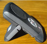
With its size being similar to two packs of cards sitting next to each other (3.24″ x 5.25″ x 0.85″/ 85 cm x 135cm x 25 cm), you would have no hesitation in chucking it in to your bag when you’re on a business trip.

Polycom Communicator Review: Handsfree Skype (83%)The centre-top is dominated by a high quality (22 KHz) speaker, with twin microphones on either side of the bottom front corners. This not only gives excellent sound reproduction (actually beyond Skype 16KHz capabilities), but the dual mics make it easy for many people around a table to take part in the conversation. The microphones are independently balanced, so a person sitting a distance away from one would not be drowned out by another sitting close to the other.
The middle section of the unit has a collection of five buttons arranged within a circle. On the left is a blue Skype-logo’s button, that when pressed, makes the Skype software on your PC become active. The button on the opposite side of the circle connects and disconnects calls. Volume controls are at the top and the bottom, with a mute button in the centre.

Polycom Communicator Review: Handsfree Skype (83%)Around these buttons is a circular LED that gives progress on the call – it flashes green when connecting the call, glows green when on a call and red when the conversation is muted.

The back is hinged to provide two features – holding the 79 cm (33″) long USB lead that wraps around the back, and to act as a stand for the unit when it’s in use. Like the rest of the unit, it too, has a reassuringly-solid feel about it, with a hinge that feels like it will last.

The intelligent design touches continues on this flapped hinge with its rubber corners, minimising movement where it rests against the table.

Summary
A great, quality device that works easily and well, providing you with a better way of making Skype calls.

Score: 83%

Ups
Great quality calls on Skype Superb speaker for music-listening Well designed and compact

Downs
No Mac or Linux support yet

Cost
US RRP $149

Polycom Communicator

Buy it at Amazon UK (Blue)

Buy it at Amazon US (Grey)
Buy it at Amazon US (Blue)

BoxWave Dual Handsfree Stereo Adapter For Palm Treo Review (80%)

BoxWave Dual Handsfree Stereo Adapter For Palm TreoIf you’re fed up with having to use the rubbish headphones that came with your Treo, you may want to consider investing in BoxWave’s Dual Handsfree Stereo Adapter.
Like many other mobile manufacturers, Palm elected to use the non-standard 2.5mm headphone socket, meaning that you can’t use your favourite headphones with the device.

Although many electronics stores like Maplins carry simple 2.5mm (male) to 3.5mm (female) stereo adapters, your listening pleasure is going to be interrupted every time you take a call as you’ll have to unplug your headphones every time. Not cool.

So here’s where the BoxWave’s Dual Handsfree Stereo Adapter comes in.

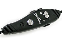
BoxWave Dual Handsfree Stereo Adapter For Palm TreoThe unit features a simple (gold plated) 2.5mm to 3.5mm adapter which connects up to a small control unit which includes an integrated microphone, single-touch answer call button, volume control, and a switch for toggling between music and handsfree phone mode.
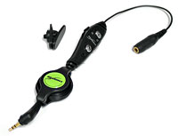
The adapter also comes with a removable lapel clip so that you can clip the microphone to your jacket, and to avoid the usual spaghetti tangle of wires, there’s a clever cable retract/recoil design that winds in any excess cabling.

Giving it some welly
We tested the adapter with a Palm Treo 650 and a pair of Grado SR60 cans.

BoxWave Dual Handsfree Stereo Adapter For Palm TreoGiving it a bit of welly with some MP3s played back on Pocket Tunes, everything worked as advertised, with the music mode automatically pausing the tunes whenever a call came in on the Treo.
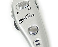
As soon as the call was finished, the music would kick back in again, so there was no need to go rummaging about in bags or pockets. Sweet.

We also liked the retractable cable, although there’s no denying that the combination of adapter, cable coiler and control unit added a bit of bulk.

Although we initially had a problem with a noisy potentiometer (that’s a volume control to most people, but we’re trying hard to impress you here), Boxwave were quick to send out a replacement, so it looks like their customer service is on the case.

BoxWave Dual Handsfree Stereo Adapter For Palm TreoOverall, we found the BoxWave to be well worth the outlay (currently on offer from their site at $20.95) and a great investment if you want to be able to get the best music performance out of your Palm Treo 650/700p/700w.
If you haven’t got a Palm, you might be interested to note that Boxwave also do a Dual Handsfree Stereo Headset which replicates most of the functionality of the Palm version, but has non-removable headphones – check out their page for compatible models.

Features: 80%
Build: 80%
Value For Money: 85%
Overall: 80%

BoxWave Dual Handsfree Stereo Adapter

446m Mobile Phones TV User By 2011? We Consider

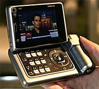
446m Mobile Phones TV User By 2011? We ExamineWill you be one of the near-half billion (446m to be exact) people that IMS Research estimate will be watching TV on their cellular handsets around the globe by 2011?

Their latest research project a 50% year-on-year growth all of the way until 2010.

In a frankly over-optomistic tone, one of the report’s authors, Stephen Froehlich exclaimed, “Given the right conditions, mobile TV has the potential to spread from one customer to the next like few technologies before it.” We assume he either lives in the US, where text messaging didn’t grow at the speed it did in Europe, or he’s got a short memory. SMS was the ultimate viral application on mobile.

There’s been a lot of buzz about DVB-H, built up by a combination of the TV and mobile phone companies. It’s not far off the truth that the content industry are obsessed with video content on mobile phones.

Our take – All of these estimates are a pipe-dream if the mobile operators think that their subscribers are going to pay to watch TV, at the data rates that are charged by many companies, certainly those in the UK. People’s mobile bills are pretty huge already and they have a lot of other things to be spending their money on.

446m Mobile Phones TV User By 2011? We ExamineIMS Research

The Long Tail Book Review (95%): Why The Future Of Business Is Selling Less Of More

The Long Tail Book Review: Why The Future Of Business Is Selling Less Of More
by Chris Anderson

Published by Random House (UK), Hyperion Books (USA),

Retail price – UK £17.99, USA $24.95

Buy the book from Amazon US or Amazon UK
Buy the audio book from Amazon US

Summary
The Long Tail Book Review: Why The Future Of Business Is Selling Less Of More (95%)The Long Tail is an important manual for the new economics of the Internet and digital culture. As well as demystifying the numbers it provides an essential guide to how to navigate a world where everything is available, all the time. Score: 95%

Review
Every once in a while a book comes along that completely captures and defines a particular period. Nicholas Negroponte’s Being Digital defined the blossoming digital culture of the mid 90’s, now The Long Tail shows how the Internet will radically change our habits and behaviour.

Chris Anderson illustrates how our buying habits have been shaped by the economics of big business, creating the blockbuster culture; the selling of a narrow range of products to the biggest possible group of consumers. Anderson shows how the Internet, through companies such as eBay, Google and Amazon, radically changes that, allowing us to be more exploratory and specific about what we buy.

“The theory of the Long Tail is that our culture and economy is increasingly shifting away from a focus on a relatively small number of “hits” (mainstream products and markets) at the head of the demand curve and toward a huge number of niches in the tail. As the costs of production and distribution fall, especially online, there is now less need to lump products and consumers into one-size-fits-all containers. In an era without the constraints of physical shelf space and other bottlenecks of distribution, narrowly-target goods and services can be as economically attractive as mainstream fare.”

Anderson provides and eloquent and detailed analysis of various aspects of Internet culture and business and illustrates how the explosion of niche markets and filtering tools will allow us to zero-in on things that interest us, potentially shattering the hold that large manufacturers and retailers have exercised since the mid 20th century.

The Long Tail Book Review: Why The Future Of Business Is Selling Less Of More (95%)The Long Tail effect is not limited to buying and selling, the process by which the book was written is a case in point. Anderson (editor in chief of Wired magazine) published the original Long Tail article in Wired back in October 04. The article rapidly became a hit and mushroomed into the Long Tail blog which Anderson used to publicly research and test his theories. Shortly before the publication date earlier this month, Anderson released copies of the book to bloggers across the globe for review. The process is a perfect example of a product being tested and developed publicly, thereby generating enough word of mouth interest to create a ready market for it. The strategy was proved a resounding success by the book’s appearance in Amazon’s top ten non-fiction list on its publication day.

Although The Long Tail is a business book, it is also about culture in general and how it’s changing. Freed from the constraints of the blockbuster culture, the consumer is able to delve into niches he never knew existed and also to contribute in a way that was not previously possible. The success of social software services such as Flickr and YouTube has allowed the audience to create and share their own material generating a genuinely new, interactive media which is actually competing in some respects with mainstream broadcast media.

The Long Tail Book Review: Why The Future Of Business Is Selling Less Of More (95%)Some have taken this to mean that Anderson is sounding the death knell for blockbusters, something which he was at pains to counter on his blog, “Hits Aren’t Dead” he said, “I never said they were. What is dead is the monopoly of the hit. For too long hits or products intended to be hits have had the stage to themselves, because only hit-centric companies had access to the retail channel and the retail channel only had room for best-sellers. But now blockbusters must share the stage with a million niche products, and this will lead to a very different marketplace.”

While not all the ideas in The Long Tail are Anderson’s own, like any good journalist, he manages to articulate the complexities of a difficult subject in a lucid and entertaining style.

Summary
The Long Tail is an important manual for the new economics of the Internet and digital culture. As well as demystifying the numbers it provides an essential guide to how to navigate a world where everything is available, all the time.

Score: 95%

Published by Random House (UK), Hyperion Books (USA),

Retail price – UK £17.99, USA $24.95

Buy the book from Amazon US or Amazon UK
Buy the audio book from Amazon US

Gotuit Review: High Quality Video Playback Site (87%)

Gotuit Review: High Quality Video Playback Site (87%)If you thought that YouTube was going to rule the roost forever in delivering videos over a Browser, think again.

Gotuit Media launched their service late on Sunday, and by the looks of it have got an awful lot right.

Their model is ‘offering premium video content from some of the most established content providers in the industry,’ so all of the commercial videos that are being pulled from YouTube then.

GoTuit has been tipped for a while, getting named as a finalist for the Red Herring top 100.

What have they got right?
The service is highly impressive. The videos load and start really fast. This is especially impressive as their quality is spectacular and rich. True, the site isn’t at anything like the number of views that YouTube has, but they’re currently beating the pants off them with startling speed.

Don’t be fooled, this site is about making money for the owners. It wouldn’t be surprising if the companies that own the videos that you are watching are being paid for you to be shown, or will be shortly.

Gotuit Review: High Quality Video Playback Site (87%)Every two or three videos that you watch will trigger the showing of a video advert. They’re currently running at 30-seconds, and I’d imagine that they’ll stay at that or less. Anymore and people will see it too much as a barrier to seeing the content they want. Most of the ads I’ve seen today have been for the Library of Congress

Commerce (buy now) button. Currently clicking on this brings up a search for the artist on amazon.com. It is slightly buggy today, but you can clearly see the potential.

Enough of the money side, what else have they got right?

Expanding the video to double the size is instant, with none of the restart issues that the YouTube player has. Small things like this improve the user experience considerably.

The content is pretty strong. TechCrunch is reporting that there’s 2,000 videos available at launch, with the plans to add more soon. The short films that they have on there aren’t the dross you often see on sites, they’re stylish and accomplished, see examples like Peep show.

What’s missing?
For me … I like to be in control of the media that’s playing, so a lack of timeline is a major draw back – it stops you scrubbing back and forth in the video that’s playing. This may be down to the magic they’ve used to get the video to play so darn fast, perhaps the downside of it is that you can’t control where you want to move in the video file.

We’ve spoken about the advertising as a means to income, but even understanding this, I find it annoying that there’s no option to skip adverts.

There will be lots of sites around with the majority of the videos this site is showing, so the one which gives that flexibility, will be the one people stay with.

Perhaps it would be better to let people reject the ads they don’t want to watch, then offer them an option to pay for the content if they don’t want to see the ads.

The very least they should have is the ability to let them know if you like this type of ad/product or not, using simple thumbs up or down. At least that way they’ll get to understand a little more about you.

Summary
All in all, a very strong entry in the video market, which sets a pretty high bar for other entrants in the soon to be flooded watching videos online market.

Score – 87%

Fizz Traveller 2.3 For Pocket PC/MS Smartphone Review (69%)

Fizz Traveller 2.3 for Pocket PC/MS Smartphone ReviewWedging its foot firmly into the territory currently ruled by rival application World Mate, Fizz Traveller for Pocket PC is a mobile travel companion, compatible with Windows Mobile 2003/2005 and Smartphone editions.
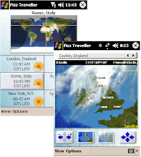
As befits its travel aspirations, the program comes stuffed with information useful to globe trotting types, offering world time, international weather information with forecasts, alarms, to-do lists, Internet-updated currency conversions and more.

Loading up the application on our i-mate JAM, we were taken to a large clock with some daft confetti stuff stuck all over it that promptly sent us looking for the ‘how we did get rid of this’ option.

A rummage through the menus revealed that the developers were pretty keen on the eye candy, with customisation options letting users fiddle about with various themes, background images, clock styles and colours.

Fizz Traveller 2.3 for Pocket PC/MS Smartphone ReviewGreat if you like that kind of thing, of course, but we’d be happier with just one clean, crisp and professional interface than a load of bubbly, baubly spinning things.

We found the overall interface a bit of a pain too, with an animated menu system needlessly complicating matters, although we were impressed with the information that could be (eventually) displayed.

On a more positive note, the Today plug-in that ships with Fizz Traveller was a well designed addition that could be configured to show the current date/time and weather information, and cycle through other modes.

Talk about the weather
The program comes with 58,000 pre-programmed world wide cities, with the option to display more detailed time and weather for six user-selected ‘Favourite Cities,’ along with a pretty little map.

Fizz Traveller 2.3 for Pocket PC/MS Smartphone ReviewSadly, you couldn’t zoom into the map so it wasn’t the greatest of travel aids.

The weather information was, however, impressively comprehensive, offering min/max temperatures, precipitation, forecast maps, satellite maps and 2/7 day forecasts, as well as an “Airport Delays” option which didn’t seem to be particularly useful.

More useful was the currency conversion section which, like the weather forecasts, could be configured to update wirelessly at preset intervals.

Wrapping up the feature set was a mixed bag of conversion tools for temperature, length, weight, area, volume, speed, power and torque.

We can’t recall the last time we found ourselves needing a program to convert horsepower into Kilowatts when we were on out travels, but we’ve certainly got one now.

Conclusion
There’s a lot to like about Fizz Traveller, with the program offering lots of useful, travel-related functionality and a well executed Today plug in.

Fizz Traveller 2.3 for Pocket PC/MS Smartphone ReviewWe liked the weather maps and there’s no denying that the interface has been buffed and polished up to a very high standard with lots of options for folks who like to customise their app.
The only problem was that in their quest to produce the prettiest travel application around, usability occasionally flew out of the window.

Compared to its chief competitor, WorldMate 2006, the program often felt clunky and slow, and at times we found the pop up navigation system downright annoying.

It’s not all bad news for the Fizz crew though, as the program offers similar levels of functionality to their rival but retails for substantially less ($20 against WorldMate’s $35), so we’re sure some will be prepared to put up with the quirks of the interface to save themselves a few bob.

Features: 80%
Ease of use: 60%
Value For Money: 75%
Overall: 69%

Fizz Traveller 2.3 for Pocket PC

Why I Still Love The Palm: A Short Guide To Best Treo Apps

Why We Still Love The Palm (Pt 3)Here’s the third in Mike’s three part review of why the Palm Treo rocks his boat.
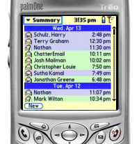
Iambic Agendus application on the Palm OS.

When partnered with the optional Agendus Windows Desktop application, the program is a masterclass in interface and usability design and is – in our opinion – a good enough reason to move to the Palm OS alone if you’re after a world class PIM.

Despite the enhanced feature set, more powerful processor and more modern software, I constantly found Windows Mobile to be a frustrating experience, with many functions unnecessarily complicated.

Why We Still Love The Palm (Pt 3)Word!
Even with Microsoft’s own products, the Palm did a better job, with the bundled Documents to Go application on the Treo proving far more effective at handling Word, Excel and PowerPoint documents than its Microsoft Mobile counterpart.

When it comes to email the Treo ended up streets ahead again, with the hugely powerful third party email application Chatter Email beating everything I’ve seen on the Pocket PC platform (the less said about Palm’s built in Versamail client the better, however.)

Why We Still Love The Palm (Pt 3)It’s the same story with SMS, with the built in text messaging interface on the Palm remaining streets ahead of its Pocket PC rivals, with the superb auto-threading conversations making it easy to keep track of text conversations. It really is a delight to use.

Being a mature platform, the Palm OS has grown has a ton of capable, office-related, third party programs for taking care of finances and budgeting, databases, project management and travel etc., so you’re sure to find something for your needs.

In our next installment, I’ll be looking at Palm’s connectivity and having a moan about the lack of Wi-Fi.

MicroQuad By Viex Games Review (90%)

MicroQuad By Viex Games ReviewAnyone who enjoyed Mario Kart on the Nintendo SNES back in the 90s will love MicroQuad by Viex Games.

Available on the Palm, Symbian Series 60 and Windows Mobile platforms, this is an old fashioned racing game that packs in an astonishing level of detail and playability.

We tested the game on the Palm Treo 650 and the graphics were fun, fast, slick and ran as smooth as a slippery thing in banana boots sliding over an oil slick.

The game
You certainly get a lot of bang for your buck, with a total of twenty different tracks/levels (that’s four unique tracks, each with five difficulty levels) and – apparently – some hidden unlockable tracks lurking within the game.

Gamers start off by taking part in the Baby Cup, and once enough games are won, they can progress through the Junior Cup, Pro Cup, Master Cup and eventually the Expert Cup.

MicroQuad By Viex Games Review (90%)At the beginning of each game you can select any one of six different bikes, each offering different strengths and weaknesses (road, off road and grip).

As well as navigating the ever-curving terrain at high speed, racers have to avoid oil slicks, sticky patches and missiles launched by competing karts.

Playing the game proved to be a whole load of fun, with the bright, colourful tracks, lively animation and attractive scenery making it something of an immersive, compelling experience.

Controlling the game
Playing the game via the Treo’s five-way controller was effortless, with the option to customise the placement and function of handset buttons via the game’s options menu – and there’s even a left-handed mode on offer!

We had no problems running the game off our 2 GB Sandisk SD card and the game proved to be rock-solid in use with no crashes (and we’ve been playing it a lot!).

MicroQuad By Viex Games Review (90%)The game also offers an internet high score competition, a Bluetooth multiplayer option and a ‘Quick Race’ option if you fancy a quick blast around the tracks.

Conclusion
We liked this game. A lot.

It offers great value, exceptionally high quality graphics and a level of gameplay so addictive it can only be described as perilous.

The game’s tough enough to keep you coming back for more too, so you can expect a dramatic slump in productivity as soon as you install the game on your handset!

MicroQuad can be downloaded from Viex.org for just $14.95 (€12, £8).

Scores on the door: Features: 85%
Gameplay: 90%
Graphics: 90%
Value For Money: 95%
Overall: 90%

Compatibility:

Palm OS:
Tungsten E, T, T2, T3 and C
Zire 31 (low resolution), 71 and 72
Treo 600 (low resolution) and Treo 650
Sony Clie Series NX, NZ, TG, TH, TH and UX
Tapwave Zodiac 1 and 2

Pocket PC Windows Mobile 5.0
(tested on a Qtek 2020, a Qtek S100, a HP iPAQ 5550, a HP iPAQ 3950, a HP iPAQ 4700, a HP hx 2750, a Toshiba e800 and a Garmin iQue M5.)

Series60 Symbian
(tested on Nokia NGage, Nokia 6600, Nokia 7610 and Nokia 3650)