Previous instalments of this comprehensive UK iPhone review were the build of the iPhone & its interface and how it is to use it as a phone, texting on it and emailing.
 Web Browser
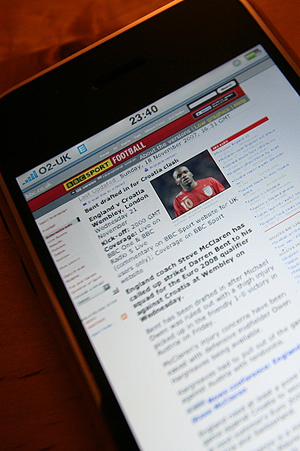
Although it’s touted as being the first to do full, real, web pages, Opera Mini 4 isn’t far behind on this front. But again, the touch UI brings it to life. Zooming and scrolling means you can navigate complex pages in orders of magnitude faster than Opera.
There’s some irritations in the browser. It often re-fetches a page, when you’d expect it to use a cached version – such as when you go ‘back’. Opera Mini is way faster here, neatly sliding the previous page into view.
Other things: Safari can crash. It’s done it twice to me, in 24 hours. Admittedly I was pushing it – attempting to view a full 8megapixel JPEG on Flickr. But that’s no excuse. It shouldn’t crash. The only ‘upside’ (is it an upside?) is that the it’s only Safari that crashes – everything else is alive and there is no temporary lock up.
Now the 64 million dollar question… is it crippled by the lack of 3G? On EDGE, it’s reasonably snappy. The main page of the urban75 forums loads in about 10 seconds or less, and threads load a little faster than that. It’s easily comparable with Opera Mini running over EDGE.
On GPRS, things slow down. I’ve not yet been able to properly benchmark this, but gut feel so far suggest it’s half the speed. Some sites still seem usable – urban forums is ok-ish. But here I suspect that Opera Mini will win by a margin, thanks to it’s proxying system – pages are assembled by an intermediate server, and sent to the phone as a single datastream.
This enables several things: One, it removes the compounded latency in retrieving lots of page objects. It also facilitates compression, and smart management of images to reduce the payload. All in all, the foundation of Opera Mini is smarter than simply putting a full browser on a handheld device. Another point to note is that you can’t turn off images in Safari. (There’s an oddity here – for some reason images are ultra compressed, with JPEG artefacts showing up where the source image has none. How or why it’s doing this, without a proxy, is beyond me).
 Some of render wait is offset by the UI. Whilst pages are swift on Opera Mini, navigating them – particularly version 4 with zooming – is awkward and therefore slow. So, at the moment – when it comes to GPRS browsing – I’m only half convinced by either solution. Maybe, with more use, I’ll get a better feel for which is better.
Obviously WiFi browsing is fine, but there’s an extra hit on battery for this.
There’s more on connectivity in the next section of the review …
iPod
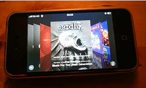
This is largely what you expect, with the added magic of the touch UI. Tunes are automatically faded out when the phone rings. The coverflow feature, showing album covers in a ‘rifflable’ form, is cute. Over on iTunes, things aren’t quite as straightforward as before – having to manually add things to a playlist, rather than just using the checkboxes, is an irritation, albeit a small one.
 Google Maps
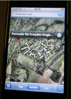
This is a big leap over the standard Google maps application that you can download for other phones. Functionally it’s identical, but the zooming, scrolling and display size make it massively more usable. Even on GPRS, I could manually locate specific streets, incredibly quickly. Doing the same on the Nokia, even with it’s 320×240 display, on the other hand, is tedious. Left a bit, up a bit. Zoom in. Oh. too close. Zoom out. Lost the detail I needed.
The iPhone implementation is, in comparison, simply a joy.
Next and final instalment will be playing videos on it, its connectivity and whether we’d keep it or not.
Comments
2 responses to “UK iPhone: Detailed Review: Its Web Browser, iPod-ness & Google Maps”
[…] edition of this UK iPhone review will be the Web browser, it’s iPod-ness and the Google Map […]
[…] This is the concluding section of this comprehensive UK iPhone review. We’ve previously covered the build of the iPhone & its interface; how it is to use it as a phone, texting on it and emailing; Its Web Browser, iPod-ness & Google Maps. […]