 We’re all to aware that many sites have reviewed the iPhone, but the vast majority of them have been done by American sites.
Following last weeks UK release we thought it would be interesting to have a look at it through UK eyes, after all, nationalities use devices differently – a great example being the UK obsession with SMS texting, compared with the US not really seeing its value.
It’s a detailed look at it, so we’ve split it in to four sections which we’ll release over the next four days.
Hope you enjoy it – Editor.
Physical Device
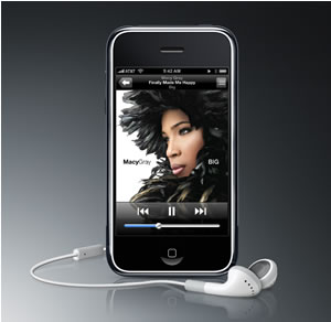
The iPhone certainly can’t claim to be small – but it is slim. Not quite as slim as an iPod touch, but almost the exact same depth as the Nokia 6300, which is generally regarded to be one of the slimmer phones on the market.
Held in the hand, the iPhone feels a little too big – although this is inevitably the price to pay for the impressive 480 x 320 display. The Nokia’s LCD, at 320 x 240, is one of better handsets for display capability, and yet – with half the screen space of the iPhone – it pales in comparison.
 Like the iPod, the headphone socket is at the top – meaning that the device stays ‘the right way up’ when you put it in a pocket. But, as has been noted in most reviews, the socket recess is narrow – precluding the use of many existing 3rd party headphones. Adaptors are available, and it’s likely the accessory manufacturers will re-engineer their plugs to fit the iPhone.
On the opposite side from the headphone socket, is a simple on/off switch. This combines with a slide-to-unlock UI on the screen, to prevent accidental use.
Although my use has been limited to just 24 hours it hasn’t picked up any scratches – unlike the first iPod Nano, which could be scratched with a fingernail.
 User Interface
Unless you’ve been living under a rock, you’ll know that this is a key selling feature of the iPhone. But is it merely a novelty? The short answer: No.
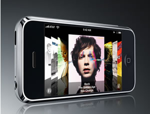
Scrolling and zooming is not only infinitely easier than using buttons, but also much, much faster. Operations like diagonal scrolling, stop being a dull game of up a bit, side ways a bit. Zooming is not only intuitive, with the pinching movement, but also much, more accurate – gone are the fixed zoom levels that are often either too close or too far, when one is navigating things like maps.
The touch user interface is a genuine time saver. You get to do more of what you are actually trying to do, much more quickly.
Typing! Ah, now that was something that raised a few eyebrows when first said there would be no keyboard. Surprisingly, it’s better than one might imagine. Much of this is thanks to the auto-correct. Providing you hit the right number of letters for a word, the iPhone generally guesses the right thing, first time. Don’t be fooled into thinking this is just like T9 – it is far better. No more “fancy a riot”, when actually you mean “pint”.
When you enter words that aren’t ‘words’, such a URLs, typing speed slows down. It’s still way superior to a numeric keypad, but more hit and miss, I suspect, than using a full keyboard like the one on the Blackberry.
Possibly the least fun thing is password entry. Although the letters still light up in the keyboard, the visible text entry is – not unreasonably – masked as blobs rather than actual characters, making it a careful game of hover-and-dab, to get the right key.
Other niggles, for me: Hitting return when I want delete – just adding to the mistake I’ve already made.
Tomorrow we cover the phone itself, texting and email.
Comments
4 responses to “UK iPhone: Detailed Review”
[…] Yesterday the Physical characteristic of the iPhone’s and its User Interface. […]
[…] instalments of this comprehensive UK iPhone review were the build of the iPhone & its interface and how it is to use it as a phone, texting on it […]
[…] The hefty expense of owning an iPhone was seen as a major reason for the lack of wallet-opening amongst punters, despite a general enthusiasm for the way the thing looked and operated (indeed, our well-heeled reviewer was very positive about the phone in our in-depth review). […]
[…] is the concluding section of this comprehensive UK iPhone review. We’ve previously covered the build of the iPhone & its interface; how it is to use it […]