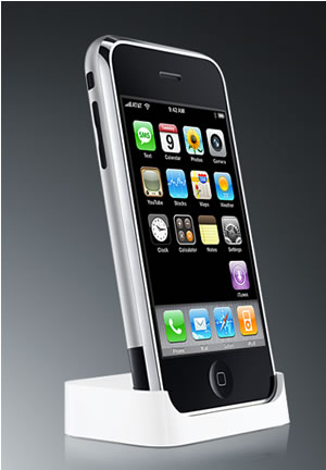
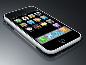
Yesterday’s UK iPhone review covered the Physical characteristic of the iPhone’s and its User Interface.
 The Phone
There’s not a lot to say here yet. It works. A giant on screen keyboard means that manual dialling is error free, and the contacts list is incredibly quick to navigate. If you get a lot of voicemail, the visual voicemail feature will come in handy – the ability to see your voicemails as a list to choose from.
And, as well as being able to cherry pick the message you actually want to hear, you can stop, rewind, replay, just by dragging a slider. This comes into it’s own when someone has left a tediously long message, with one key bit of information right in the middle of it.
Also, there is call merge, making it very easy to set up three way calls. You can merge calls regardless of whether they are incoming or outbound. It’s not something I’m likely to use myself mind.
Whilst a call is active, the rest of the iPhone functionality is still there. You won’t risk dropping a call, as you try to fish something out that you need whilst staying on the line.
Texting
In common with the Nokia – but not all phones – messages can be sent as ‘fire and forget’. You can immediately carry on doing other things, without waiting for the actual send to happen.
Also there’s threaded text conversations. It certainly looks cute, although how much of productivity benefit it is questionable. This is probably more of a fun factor thing than anything else.
 But it goes rapidly downhill from here. There’s no MMS. It’s not something either me or my friends ever use, but if you want it, sorry, it’s not there. And there’s more – or perhaps I mean less. You can’t send messages to multiple recipients. And you can’t work around it. Not only is there no cut and paste, there is no ability to forward messages – whether they are ones you have received or sent.
All in all, the text features are ridiculously basic. How Apple managed to get this so wrong, is hard to fathom when you see all the other things it does so well. And it’s not even as if it’s a niche feature like diary management. Current owners can only hope that Apple sorts this out in a future software update. Until then, there will be occasions when – for a given task – the iPhone will be a thing of loathing.
Email
I’m a gmail user, so Google’s recent addition of IMAP functionality fits very well with mobile email use. It took a minute or so to set up, and then I had my inbox on screen. It also supports the gmail tags, as pseudo-folders, but other gmail specific features, such as ‘mark as spam’ are missing – due to it being a generic mail client rather than Google specific. The regular gmail web client can also be used, and there those features are present, as you would expect.
Down on the tube, with no reception, I thought ahh, IMAP… I bet email is now out of the question. But, to my surprise, the inbox was not only all there, but I could open and read the messages too. Clearly there is caching going on, and it’s seamless.
Again, the touch UI really adds some value here. Sifting through big inboxes is a snap. No click click click scrolling – just fly through to the message you want, if you don’t want to do a typed search.
Next edition of this UK iPhone review will be the Web browser, it’s iPod-ness and the Google Map application.
Comments
3 responses to “UK iPhone: Detailed Review: As A Phone, Its Texting & email”
[…] Tomorrow we cover the phone itself, texting and email. […]
[…] UK iPhone review. We’ve previously covered the build of the iPhone & its interface; how it is to use it as a phone, texting on it and emailing; Its Web Browser, iPod-ness & Google […]
[…] Previous instalments of this comprehensive UK iPhone review were the build of the iPhone & its interface and how it is to use it as a phone, texting on it and emailing. […]