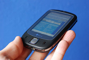
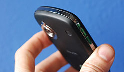
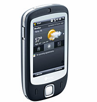
 In Part Two we looked inside the Touch and at connectivity and multimedia functions.
TouchFLO
HTC have redesigned the Windows Today screen, with a moody dark finish displaying the time in big LCD-style numbers, and three thumb sized buttons giving quick access to basic weather updates, a program launcher and a link back to the home screen.
A handy strip displays the number of unread emails, SMS messages and missed calls with upcoming appointments listed below.
Of course, the big news about this product is the new TouchFLO technology offering what HTC describes as an “innovative new concept in intuitive touch screen navigation.”
The technology impressed us at first, with main screens being flipped through with the swipe of a finger across the screen and long pages being scrolled up and down by a flick of the finger. Tapping the screen stopped the scrolling.
 Although we initially warmed to the novelty of this approach, we couldn’t help thinking that the job could sometimes be done much quicker and more intuitively with an old fashioned bash on a button.
Inputting text
Once you’ve finished swishing and swiping your way around the groovy 3D interface, you’re likely to be in for a big disappointment when you want to do something useful like input text or send a SMS.
At this point, the swish grey interface vanishes and you’re dumped straight back down to the less than glamorous graphics world of Windows Mobile 6 Professional Edition.
Anyone looking for an innovative approach to inputting text is going to be very, very disappointed as all you’re left with is a tiny onscreen keyboard and no option but to get out the itty-bitty stylus (or start growing your nails).
This, we feel, is something of a disaster. What’s the point of strutting about with a swanky style phone if you’ve got to start pecking about with a little stylus like a chump every time you want to answer an email or write a short note?
 Conclusion
When we first clapped eyes on this little fella and got a peek of the TouchFLO system, we thought that HTC had created something rather special, but the more we played with it, the less we liked it.
As a simple style statement phone, it’s rather a lovely number with great looks and reasonable phone quality, but as soon as you want to start using its smartphone features the frustrations begin.
There was a noticeable lag when switching between some applications and all that swishing about the screen soon gets the thing covered in finger marks. We also had concerns about the screen’s longevity.
But our biggest complaint was the lack of a proper keyboard. With only a tiny little set of onscreen characters available for writing emails and SMS messages, we soon grew tired of even trying and swiftly went back to our beefier, infinitely less sexy Treo 650 to get the job done.
We have to say that some elements of the HTC Touch impressed, but it feels like something of a rushed release to us, with the company looking to steal a bit of pre-release glory from the iPhone.
We like the idea of gesture based navigation, but unless it’s carried through consistently throughout the phone with some sort of genuinely useful keyboard provided, the HTC will continue to fall considerably short of its promise.
Contract price depends on the carrier, but an unlocked Touch can currently be picked up for around £300.
Our verdict
Ease of use: 55%
Build: 60%
Features: 65%
Phone quality: 65%
Value for money: 62%
Overall: 62%