 For folks a little bored of staring at the vast expanses of white space around their Google homepage comes the news that the page is finally skinnable.
Writing in her company’s blog, Product Manager Jessica Ewing, enthusiastically announced the initial release of half a dozen themes with “many more on the way.”
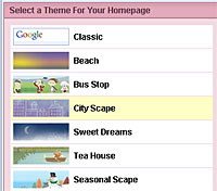
Themes are selected by clicking on a new interface which shows thumbnails of the six themes: Classic, Beach, Bus Stop, City Scape, Sweet Dreams, Tea House and Seasonal Scape,
 All of themes are dynamic and change their appearance according to your own local time of day, current weather conditions or season.
Once you’ve inputted your post /zip code, the graphics will change to reflect your local sunrise and sunset times.
“So if you happen to be stuck in a windowless office, you can at least crack open a cold one and watch the sun set over your desktop,” commented Ewing.
 Personally, we couldn’t think of anything worse than being stuck in a windowless office and relying on Google to tell you when the sun has gone down, but we get her point.
The themes are implemented via CSS (style sheets) and take the form of a large graphic across the top of the page (made up of a single repeating image so it’s still quick to download) with the page tabs switching to complementary colours.
It’s all very pretty but we’ll be looking forward to some slightly more interesting designs before we lose our old-school clean’n’simple Google homepage.
Comments
One response to “Google Homepages Skin Up”
would like a new homepage look? thank’s