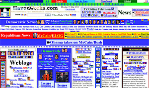
 Currently being lauded as a prime candidate for the Worst Website of 2008 is this eye-sucking monstrosity at Havenworks. com.
Described by a visitor to the Web Pages That Suck website as “too awful to even even think of a comment,” the site as Havenworks looks like it was designed by a hyperactive, colour-blind designer in 1996 and manages to fail on just about every count when it comes to user friendliness.
Bedecked in what seems like an infinite amount of links, visitors can bask in the nostalgic glow of blinking text and gaze over a multitude of unexplained and bewildering tiny graphic icons and attempt to decipher the words contained in multi-coloured text and wafer-thin columns.
As lengthy periods of scrolling got us no closer to the bottom we began to wonder of the page would ever end, although as you progress down the page, you’re often rewarded by great swathes of empty space before the page explodes back into another screen-filling technicolor nightmare.
 On a whim, we ran the page through W3C’s Markup Validation Service – a process that took so long we feared that we’d overloaded their server, imagining sci-fi cascades of white sparks to be erupting off their machines as they struggled to make sense of the hideous code.
After receiving an ‘Internal Server Error’ message we tried again and found out that the Havenworks home page contains no less than 2,127 errors, which must be some sort of record.
Other notably bad sites include Brill Publications which features a hideously pointless ‘lift’ metaphor, slowing navigation down to a crawl and the UK’s very own Alternative Transport Services, which comes bedecked with irritating animated GIFs, a multitude of text colours and – bizarrely – the phrase, “Hello Darlings” repeated all over the page.
 Perhaps not quite as bad, but still notable for its penchant for coloured text is Fraser Clark’s Parallel Youniversity which has been confusing visitors for over half a decade, while for sheer nutjobbery, the Bible-tumping www.jesus-is-savior.com has an interface that would test the patience of Job.
The Worst Website Design Mistakes of 2008
5 Worst Websites (Time)
The 10 Worst Web Sites of 2007
Comments
One response to “The Worst Web Site Of The Year?”
jesus-is-savior.com is the worst web site of the year but that Web Site is a very very extreme right wing fanatic Web Site and the way it is run it sounds like they don’t know anything what Communism is; and they are so very ill educated on Christianity as well. I truly believe the people who run jesus-is-savior.com are not really christians as they think they are.