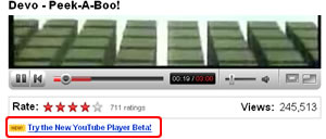
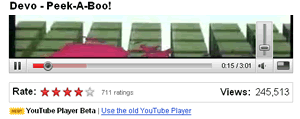
 Looking around YouTube this morning we saw that YouTube has a new video player available.
It’s in Beta, natch, and even when it’s selected you still have the ability to switch back if you want.
We’ve had a look at the new player and thought it was worth pointing out the differences that we saw. There may be a whole load of cleverness under the bonnet, but from what we could see, they mostly appear to be on the surface – styling tweaks.
- The red ‘video loaded, but not played line’ stretching left to right under the video and become lighter.
- The previously black-backgrounded time code is now sitting on a grey background.
- Volume has moved to be hidden under a button that can be shown rising up over the video window,if you feel the urge to change it.
- The full screen button is now alone, losing the button to the left, that just made the video smaller – on that frankly was never used anyway.
 While it’s good to see small improvement, it does make us wonder quite what all of the people who work in development at YouTube do all day, as the changes appear so minor. Perhaps they just watch videos all day :)