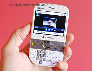
 In part one we took a look at the Palm Treo 500v’s ergonomics and form factor, and in part two we’ll see how it shapes up as a phone.
Booting up the Treo for the first time took around 30 seconds, with a succession of logos appearing on screen: first the Palm logo, followed by Vodafone’s animated feast of redness and finally the Window Mobile branding.
Interface
With no touch screen onboard, menus are navigated via a strip of controls contained in the silver band running across the middle of the phone.
Clicking the ‘start’ button takes you to Vodafone’s slick tabbed interface which we found exceptionally easy to use.
 Pressing the left/right controls on the Treo’s ‘D’ Pad lets you scroll through various interfaces labelled Message Centre, Favourite Contacts, Upcoming Events, My Settings, Windows Live, Music & Video, Recent Photos, Live! and Recent Programs. Sub menus were selected using the up/down controller with the central button being used as an OK/launch button.
Going through the tabbed screens, the Message Centre tab affords one-click access to text, MMS, email, voicemail and missed calls, Favourite Contacts offers quick access to your best chums, My Settings lets you set ring tones, home screen wallpaper, alarms and profiles and also turn Bluetooth and Flight mode on/off.
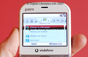
The Windows Live tab provides access to Live Messenger, Hotmail, Live Spaces and Search, with Music & Video displaying all the media you’ve got squirreled away on your phone and memory card. Recent Photos displays thumbnails of your last snaps while the Live! tab connects you to Vodafone Live!, eBay, Google Maps, Business email, Mobile TV and Internet Explorer.
 Recent Programs does exactly what you might expect, and presents a list of the last programs accessed on the phone.
Throughout the testing the interface was snappy, responsive and pleasingly simple to use. We didn’t experience any crashes and have to say it’s one of the best interfaces we’ve used on a Windows smartphone to date (and we usually end up screaming at them).
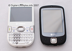
We certainly preferred it to the skin-deep glossy veneer of the HTC Touch we reviewed recently, and seeing as Palm forgot to give us a user manual, it’s testament to the UI that we very rarely found ourselves getting lost.
You can judge for yourself with this video posted up on Jason’s WebLog illustrating the Treo interface in action.
Phone quality/reception
We found call quality to be of a good standard and users had no problem hearing us at t’other end. Reception was pretty good too, although we found ourselves drifting in and out of 3G coverage a little too easily (a bit surprising since we’re ten floors up and can see a great chunk of London from our window).
The speakerphone, although unlikely to grab the attention of ex-Motorhead roadies, was loud enough to conduct an outdoor conversation or play some music in a quiet room and made a pleasant enough racket considering its small size.
In the third and final part of this review, we take a gander at how the camera shapes up, bundled apps, email and web browsing and give you our conclusion.
Comments
3 responses to “Palm Treo 500v Review: Smartphone (Part 2)”
[…] part two of the Palm Treo 500v Review, we’ll take a look at how the phone performed in use and examine its full feature […]
[…] SLR Camera (Part 3) – 14 September, 2007 Last 3 posts in Vodafone Palm Treo 500v Review …Read more…Tags: digital […]
[…] This is the last section of the review – check back on parts 1 and 2. […]