 Set for a beta launch this month, Scrybe looks to be a ground-breaking online organiser if it lives up to the claims made in the promotional video posted on YouTube.
Calendar app
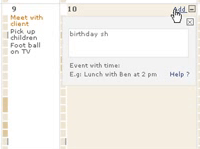
The slick Web 2.0 interface lets users drill down through calendar dates, with the context sensitive display intelligently expanding and contracting to display the required information.
Boasting sharing and collaborative tools, the program handles multiple time-zones beautifully with a polished interface and a neat feature which ran alternate time zones alongside diary pages.
According to the video demonstration, users will be able to seamlessly import popular document formats like Word, Excel and Acrobat, with lists cut and pasted from Excel automatically being converted into a ‘To Do’ list. Very neat.
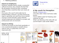
 Web snippets – complete with bookmarks, graphics and text formatting – can be copied into a categorised Thought Pad interface and integrated with calendar events and To Dos, with multi page documents browsed via a sleek, pop up graphic navigation pane.
Offline, Online…
What’s unique about Scrybe is its ability to let you work on your organiser while you’re offline, with any changes synching to your online account once you’re connected again – great for getting work done on a plane journey.
When it comes to syncing all this information with portable devices, Scrybe has gone for the oldest format of them all: paper.
It a rather daring (some may reckless) move, the program appears to forgo all thoughts of trying to sync to Palms, PDAs and smartphones and offers PaperSync – a series of clever, foldable templates that can be printed out, folded and tucked into your back pocket.
 What we think so far
So far, we’re very impressed with the interface, the offline functionality and the ambitious re-jigging of the calendar app, although the seeming lack of proper phone/PDA integration looks to be a potential Achilles’ heel.
It may be great having your week’s agenda folded up in your back pocket, but any notes you make are going to have to be manually added back into your PC at the end of the day. And where’s the email integration?
 Although the online demo looks amazing, we’ve seen far too many slick presentations be followed up by a hideous kludge of a program, so we’ve signed up to the beta trial and will hopefully be able to give you our hands-on verdict soon.
Mind you, if it looks and runs as well in the real world as it does in their promo video, Google’s usability and interface team may be sent back into the lab for some hasty overtime.