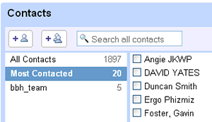
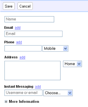
 If you’ve not been into the contacts section of Google Mail recently, you’ll be pleasantly surprised when you do, to see that it’s had a pretty major makeover. We might have noticed it earlier, but we avoided using the old contacts system as it was so clunky previously.
The most obvious change is the dropping of the oh-so-old Web 1.0-ness of it, to the adoption of Web 2.0. The result? – you don’t need to wait for the page to refresh when you update the information.
Using it is a _far_ more enjoyable experience, further proving the rule that speed of response is the first rule for interfaces.
 Clicking to add a new contact, changes the right hand panel in the blink of an eye, with the speed of response continuing when the information is saved.
Searching for contacts is also much quicker, with the results being displayed as the query is being entered.
Well done Google – a good upgrade.
Comments
2 responses to “Gmail Contacts Upgraded: Good Job”
Hey, don’t you have the coolest names in your contact list…
There’s a strong Island focus on those!