The Sky Active service, which has been around for the last five years, has this week had a considerable redesign. Originally a text-based approach, the new version is significantly richer and takes is into a magazine style. We spoke to Sky to get the details.
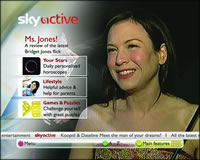
 The opening page (example right) has a video background running on the right and a small number of highlighted options on the left hand side. The layout and links on this page change throughout the day, to match the audience that they think will be looking at it. Currently changing twice it will feature items like horoscopes and lifestyles links during the day and betting and dating in the evening.
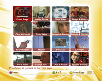
 Another way to access the content is via a mosaic layout (example right). This shows a checkerboard of 16 video pieces running on loops. As the viewer uses their remote control to navigate between the videos, bring it in to focus, the audio channel associated with that video loop plays. This short-form video programming is designed to draw people in to the interactive content that lies behind and on pressing the Select key takes them to the content.
It’s clear that Sky is putting more resources (read money) into this service. There is a full time editorial team of ten people working on it on a day-to-day basis and with the video running, considerably more satellite bandwidth is required to run the video. Sixty people across the organisation have been involved with the re-launching of the site – twenty of them within the design team.
Sky Active is creating much of the content in-house, as well as commissioning other pieces externally. The content that is being created is unique to Sky Active.
Clearly Sky is making money from their interactive service, and want to make sure that they are ahead of the game (pun intended) as other rival services are launched.